I talked to Ruth Mottershead, creative director at British paint manufacturer Little Greene, about the use and importance of pigment
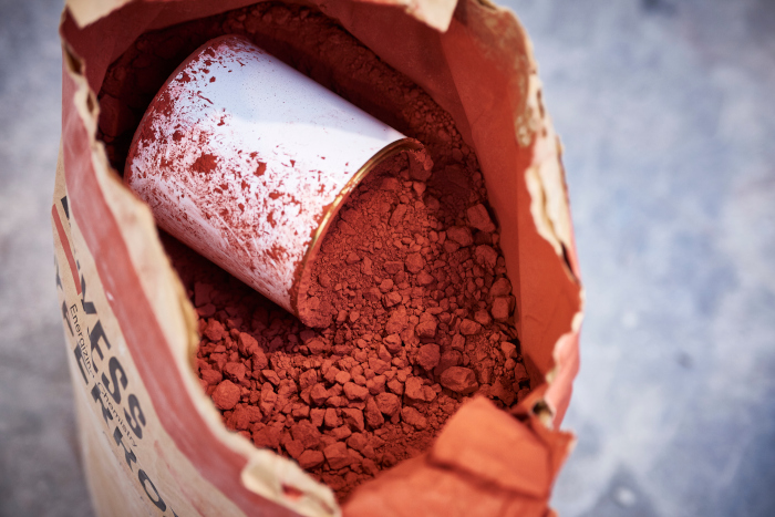
Ruth says, “There is more to choosing paint than selecting colours. The use of pigment and the effect of the pigment level should be a key consideration when sourcing and scheming paints. At Little Greene we use 40% more pigment than many ordinary paints, because to put it simply, the more pigment a paint has, the higher the opacity and the better it will cover, meaning you require less paint to cover an area.
It’s important to have very high levels of Titanium Dioxide (TiO2) which gives substantial covering power. As it’s an expensive ingredient most companies put a relatively lower amount in to reduce costs; however, this is a false economy as more paint will be required to achieve the depth of colour. In truth, the extra pigmentation makes the paint a bit more expensive, but this is compensated for as it goes so much further. This combined with other pigments and colourants gives our paint a very high ‘pigment volume concentration’ and as such, fantastic covering power.
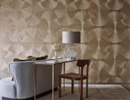
Pigments are also a key consideration where colour and scheming are concerned. Pigment families are a fantastic tool for creating easy scheming, working with colours in the same family to create harmonious interiors. Our Colour Scales are a logical and user-friendly set of colours, based on a very old principle of starting with a base colour and adding varying quantities of white to create paler shades of exactly the same hue.
As the colours within the same scale share the same pigments, they will always work in perfect harmony with one another, making them the go-to solution for easy scheming, irrespective of the lighting conditions. This harmonious relationship between the colours frees up the possibility to use them in many different combinations within a design scheme and are often used as an ideal backdrop upon which to decorate with fabrics, furniture and accessories.
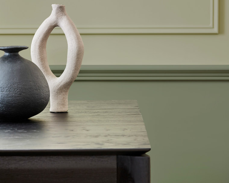
The more complex the mix of pigments, the broader the range of colours that can be coordinated. When it comes to making colours, the more pigments that are added, the more interesting and versatile the colour will be. Making a colour with only one or two pigments will give a very ‘flat’ and ‘static’ colour, whilst adding five or six pigments will give the colour far more life and personality.
You will find that as each pigment reacts differently under different light, the colour will take on different personalities throughout the day under the changing light. As fabrics react in a similar way due to their complex makeup, pairing colours that contain a large array of pigments will give a design scheme more complexity and versatility under changing light.
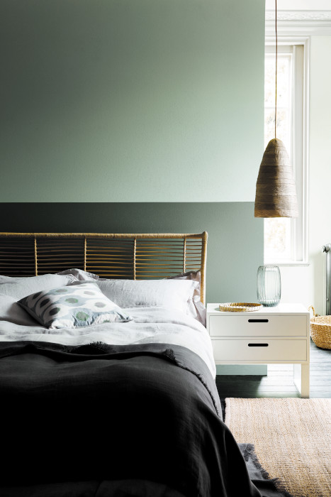
Certain colours are more versatile than others; for confident scheming, colours of a more muted nature tend to work best as they are more versatile and won’t clash as easily with fabrics or other accessories, mid tint colours such as Normandy Grey (No.79), Celestial Blue (No.101) and Light Peachblossom (No.3) are all fantastic go to colours in a scheme due to their subtle introduction of colour without being overbearing. They will also give a more muted backdrop to allow accent colours to be added in soft furnishings whilst maintaining a distinct difference from a neutral palette.”