Interior designer Emma Green took on the challenge of creating flexible spaces for this growing family
Can you tell me a bit about the property? The property is a Victorian terrace house, just off Clapham Common in Wandsworth, London.
Who was your client for this project what was their brief? My clients were a couple and their two little boys. They were returning clients. I first designed their hallway, nursery and man cave/home office. I was then asked a year later to design their master suite.
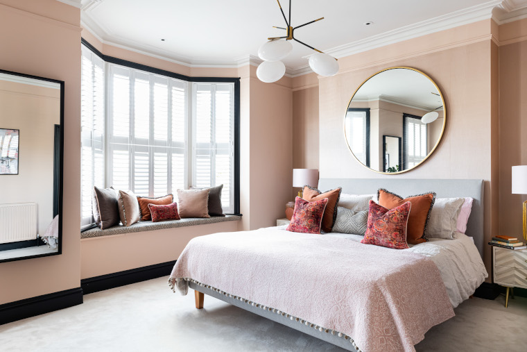
For the master suite they wanted to add some colour. This is a speciality of mine and something this client loves and is onboard with, character and impact. They also wanted me to update their existing ensuite to be cohesive with the master bedroom, whilst retaining the existing sanitaryware.
For the nursery I was asked to create a functioning and cocooning space for their new son, yet one that wasn’t too childish and could, at a later date, be used as a guest room. Quite a tall order! Also, to add lots of storage and a comfy space for my client to nurse.
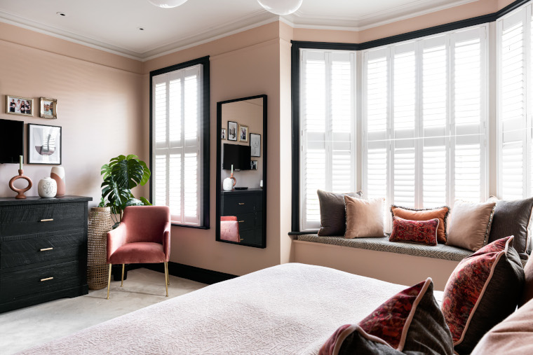
What was your starting point for the master suite and how did you decide on the colour palette? As the client wanted a touch of boutique, but I had to keep both him and her happy, I chose blush pink for the walls to create a gentle yet elegant look. It’s a warm neutral really these days and I then contrasted this by painting the woodwork in black, which provides a masculine element and really lets the blush pink shine.
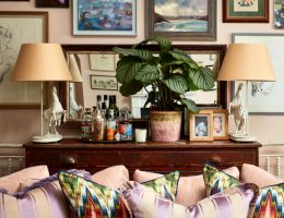
I designed and had made all the cushions for the master bedroom from a mixture of luscious velvets, textural weaves and with some fun shell trimmings and fringes.
To add extra interest to the chimney breast wall, I opted for a vinyl wallpaper, which complements the pink yet has a reflective sheen that catches the light from the window, creating an eye-catching feature in itself. It also gives a touch of glamour to the room.
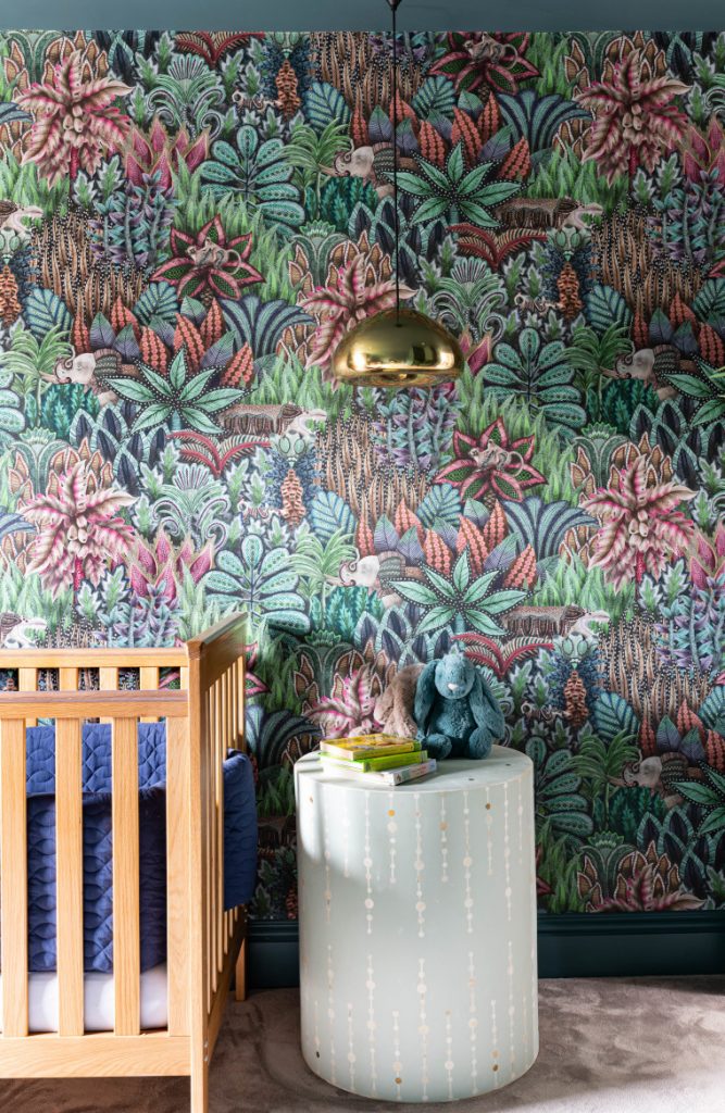
Tell me about the nursery? I chose a dark blue/green colour for both the walls and the ceiling. As it’s quite a small room this is a good tip to make the room look larger and higher as it blurs all the boundaries and edges. I sourced a special fun wallpaper incorporating animals with the same base colour. This will work equally well when the room is used for guests in the future as it’s not too childlike.
I added lots of storage and sourced some wonderful hanging pendants. This frees up space on the floor for their son to crawl, yet adds soft lighting in the evening for nursing. I added a lovely armchair and side table in one corner for my client to nurse her son. Again, this is comfortable for nursing, yet will also look stunning in the future.
For the window treatment, I’ve designed Roman blinds with thick lining and blackout lining to make the room extra dark for sleep training. I also added in some wonderful textural sheer curtains as the house is quite overlooked and this adds privacy without impacting on daylight.
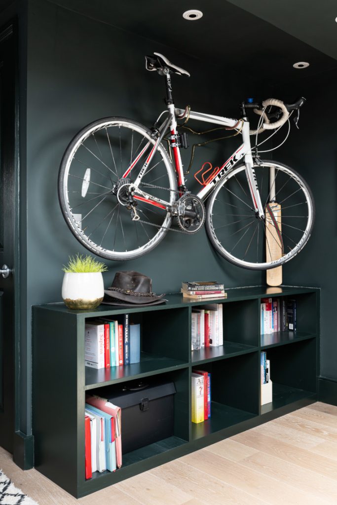
What were the requirements for the home office/man cave? To incorporate a home office, space to watch TV and also chat to clients on soft seating, lots of storage, space for the electric keyboard, somewhere to store my client’s racing bike and finally to incorporate lots of treasured sporting photos and certificates and Tin Tin artwork.
Did you specify any bespoke pieces for the project? I often design bespoke joinery, particularly for projects in London where space is at a premium. For the nursery I designed the wardrobes. These utilised every inch of the sloping celling, were fitted with a combination of long hanging (for an overspill of my client’s evening dresses) short hanging and plenty of shelves for children’s toys and clothes. These are the kind of wide-ranging requirements you can accommodate when the joinery is bespoke to you.
For the master suite I wanted to make the most of the available space so I designed and made a window seat pad for the window ledge. Bay windows can often be dead areas unless filled with a dressing table or similar, but I’ve turned this spot into a space to sit and chat and now my clients’ children love to perch and read their books here in the morning.
We also upcycled an existing chest of drawers which I painted in the same black as the woodwork and added new gorgeous handles it looks amazing. Good for the environment and the budget.
I had some bespoke cornice made for the master bedroom. This was extended around the chimney breast and was matched exactly to the original.
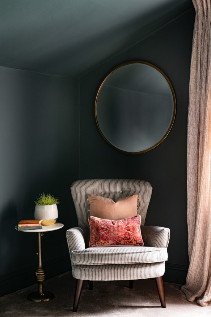
I also incorporated a bespoke lighting scheme for all the rooms. Again, something I specialise in, and something which has a huge impact when done professionally and invested in. It’s transformative.
What is your favourite design feature? I love the bull bike hook I found for the wall in the man cave. This not only allows the bike to be stored on the wall freeing up lots of space, but almost turns the bike into a work of art.
The colour scheme in the master bedroom works really well. The blush pink, black and warm oranges, rusts and burgundy give a real boutique look.
I also love the oversize mirror above the bed. I arranged for this to be professionally hung for additional security and feel it has a real impact in this room. The brass works so well with the warm colour scheme. It also bounces lights all around the space.
Emma is a member of the BIID, you can see more of her work here