I spoke to Simone Gordon and Sophie van Winden of Owl about the playful interior they created for this Central London apartment
Can you tell me a bit about the property? It is an apartment near the top of a new building in Central London, designed by architect practice Fosters & Partners.
Who was your client for this project and what was the brief? Our client is a well-known British musician whose name we are not allowed to disclose, unfortunately! The brief from the client was to “create a space that was more exciting than the (spectacular!) view” which was a really fun challenge and gave us a huge amount of creative flexibility.

What was your starting point for the interior? There were a few points of reference, the first being the view from the apartment of the winding River Thames and the big sky, which is quite an unusual vantage point in such a big city.
Our client had an art portrait of David Bowie, and being a huge Bowie fan, it was one of the only personal pieces he wanted to use in the space. The colours were deep reds and pale blues and this along with our client’s request for a playful, fun interior led us to explore the colours, patterns and silhouettes made famous by the Memphis movement.

Were there any particular challenges you had to overcome? The apartment is a pill shape and has lots of curved walls and big windows, which were tricky for space planning and storage. There were also quite a few restrictions on what we could do to the building itself.
One of the main challenges was Covid hit just as we started the project which slowed down the ordering process of materials, the contractors on-site and the manufacturing of bespoke pieces.

How did you decide on the colour palette? The David Bowie painting was a big influence, the colour palette grew from there room by room. The curved hallway flows through the whole apartment and is reminiscent of the winding Thames below. It was also the only room with no windows (apart from a tiny one) and as the sky played such a big part in the remaining space, we painted it sky blue to bring that aspect into the centre of the apartment as well.

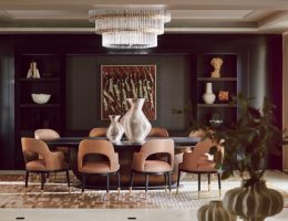
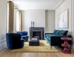
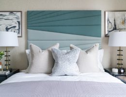
Can you tell me some of the brands used in the project – for example, the distinctive seating, lighting and textiles? Owl designed many of the key pieces of furniture and upholstery to really suit the space. We designed the curved back-to-back sofa to look both inwards toward the bespoke drinks unit and outwards to look at the view. The geometric shelving was designed to follow the curves of the architecture, we had the plaster finish continue from the walls over the shelving so it appears all as one but still stands out as a focal point. We really had fun in the bedrooms designing the striking headboards and the playful bedside tables in a lacquered finish. The patterned flooring throughout the main areas are also a bespoke design created by mixing different shades of Marmoleum.

What is your favourite design feature? The curved shelves were heavily inspired by a book on the Memphis movement that belonged to Sophie’s parents in the 80s.
The flooring in the main living area was a labour of love. It was a headache for everyone to make and install and nearly didn’t work but we are so pleased with the final outcome, we are big advocates for Marmoleum and all its sustainable credentials.
We loved designing the headboards for each bedroom, they are so playful and fun and the client completely loves them too
One of our only requests from the client was that when you opened the WC it played David Bowie’s Let’s Dance track! We took this and ran with it creating a complete disco toilet with shimmer sequin walls and a rotating disco ball.

What did you enjoy most about this project? The chance to let our creative juices flow and create a memorable interior! When Covid hit, as with everyone else, we were unsure if we would be able to carry on with our business, let alone the project but the client gave us the go-ahead to proceed and strangely it gave us a lot of extra time and space to really work on the design. It feels like a little bit of positivity that came out of such a scary time.
You can find more of Owl’s work here
(photo credit: Rachael Smith)


