Irene Gunter, of interior design practice Gunter & Co, discusses the challenges of bringing light and space to a mid-century townhouse.
Can you tell me a bit about the property?
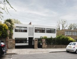
The property was a mid-century townhouse which had fallen into disarray, with a mish-mash of uncomplimentary features added to create a sense of a period property, without succeeding.
Who was your client for this project ?
This was a repeat client for Gunter & Co whose previous London home we undertook as well as his country escape.
It’s always a pleasure when clients come back as you can easily build on past experiences and be more adventurous and daring as there’s so much more trust between client and designer.
What was your starting point for the interior?
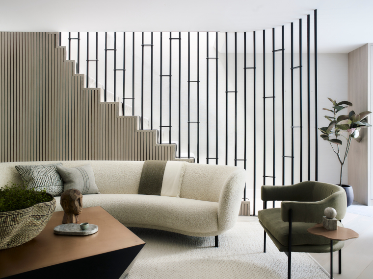
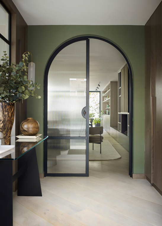
Our starting point for this mid-century townhouse was finding the perfect layout to maximise the daylight. Putting our thinking caps on to maximise daylight in the centre of the property was a real challenge, but once we came up with the layout, comprising of two different staircases, a modern tone was set. This, combined with three supersize skylights in the roof alongside generous glazed walls at the back of the property, felt much better suited to the slightly lower ceilings and overall proportions.
Were there any particular challenges you had to overcome?
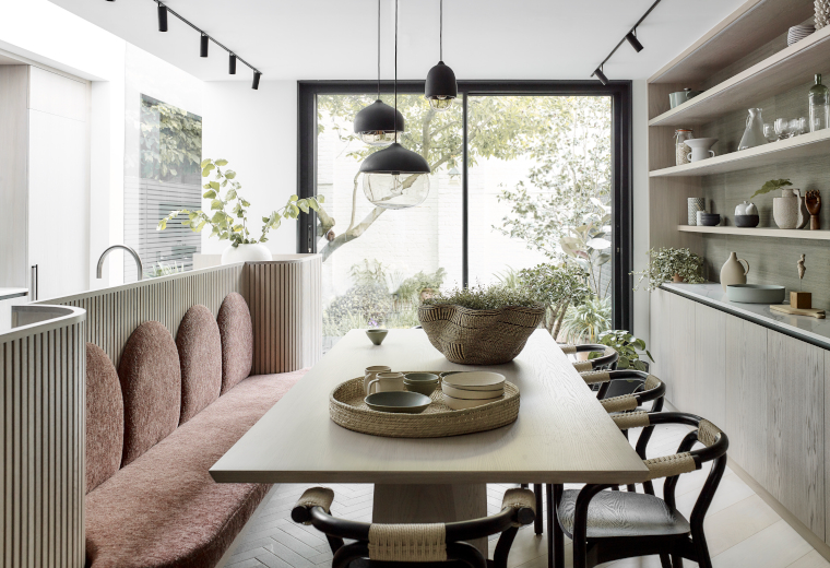
Aside from the daylight challenges, we wanted to minimise the amount of space lost in transitional areas. Thinking of how to create zoning in the large open-plan ground floor layout was key – which we achieved through different materials on the floor and varying wall finishes as well as separate lighting styles.
How did you decide on the colour palette?
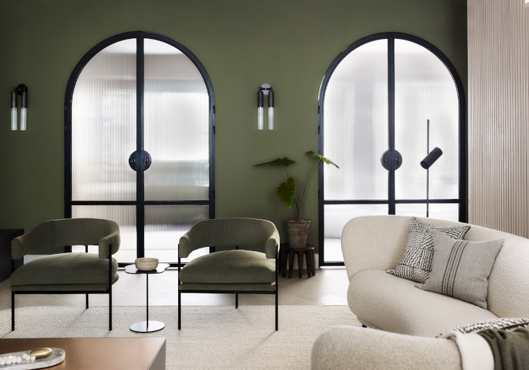
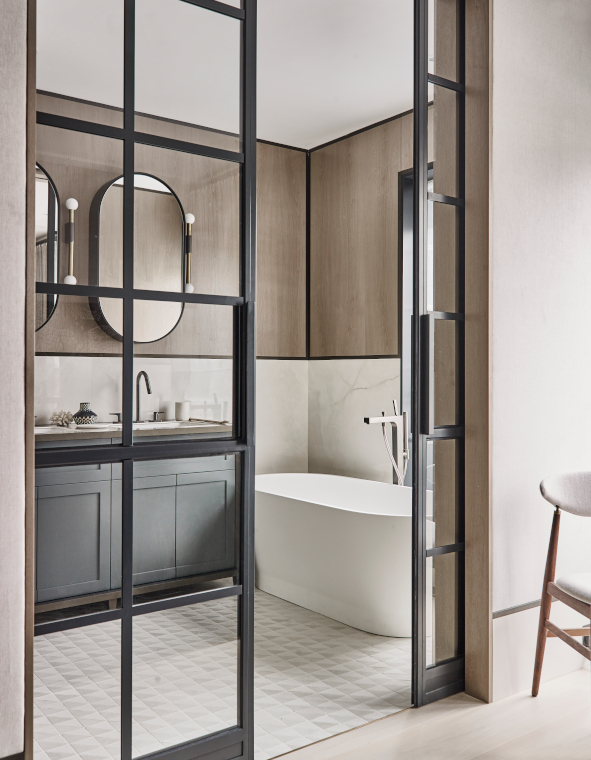
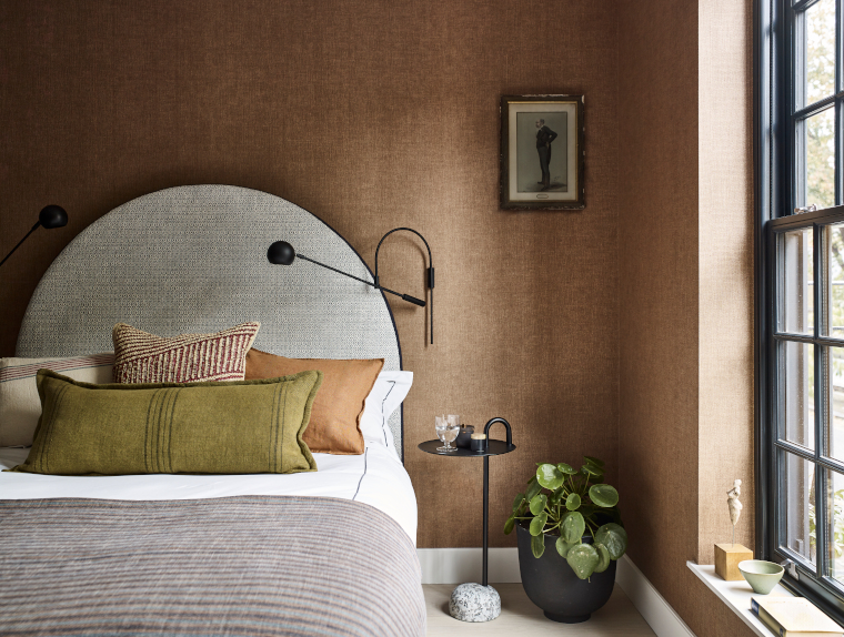
Our key objective was to incorporate a sense of cosiness and warmth in an overall modern scheme. We relied on earthy tones and shades of green paired with black accents and light white-washed oak to achieve the homely feel you see in the images, focusing on natural textures and layering.
I notice a particular theme running through the project with the use of graphic shapes – explain the thinking behind this?
The use of curves in a house which is mainly made up of straight lines and corners gives a much more human sense to the interior. Whether that is a curved kitchen island or curved staircase, all these softer shapes work on a subconscious level to make us feel more at ease surrounded by more human shapes rather than sleek harsh lines.
It’s the basic principle of biophilia applied in a more architectural way instead of simply adding a plant to a shelf. Where possible we like to take this concept and integrate it from the very early stages where layout shapes and joinery proportions set the overall tone of the property.
What is your favourite design feature?
I like that we achieved a sense of a separate dining space which feels generous and luxurious, without compromising on our clients’ desire to have a kitchen island. Coming up with a banquette design incorporated into the island was a real ‘Aha’ moment and to me it is key to the joy of living in the house.
What did you enjoy most about this project?
Setting clear boundaries at the onset in terms of materials and colour palette and working hard to restrain myself from adding more colour or pattern, as that usually comes naturally. Being able to stick to a fairly limited palette meant that the mid-century property flowed incredibly well from one space to the next, each having its own quirks and individual features to celebrate, but always tying back into the original concept.
Of course seeing the clients’ reaction at the end is always a real joy and the sense of pride gained from that is hard to beat!