Inspired by a photograph of Joan Collins, Laura Marino at Studio L has created an inviting duplex show home at Westminster Fire Station
This is not my first visit to this project. Back in June I took a look at the interiors Laura had created for the the Grade II listed Edwardian fire station. But now I’m back, intrigued to see what she has conjured up for the new Station House building.
What was the brief for the apartment, did you have a target customer in mind? The brief was based on the location of the duplex within the building. Plus, speaking with the agents and analysing the apartment’s needs to enhance its best features.
I envisaged active and stylish Londoners living there who wanted their home to be an oasis to unwind and entertain. I also reminisced about my friends and I living in New York in our early 20’s and how exciting that was. Everyone brought a different flavour and style to the décor. Still, we worked together to ensure there was harmony and flow. I still love layering different aesthetics and visual references in my designs today.
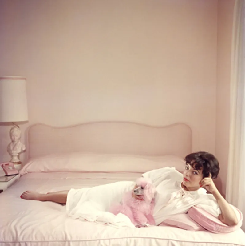
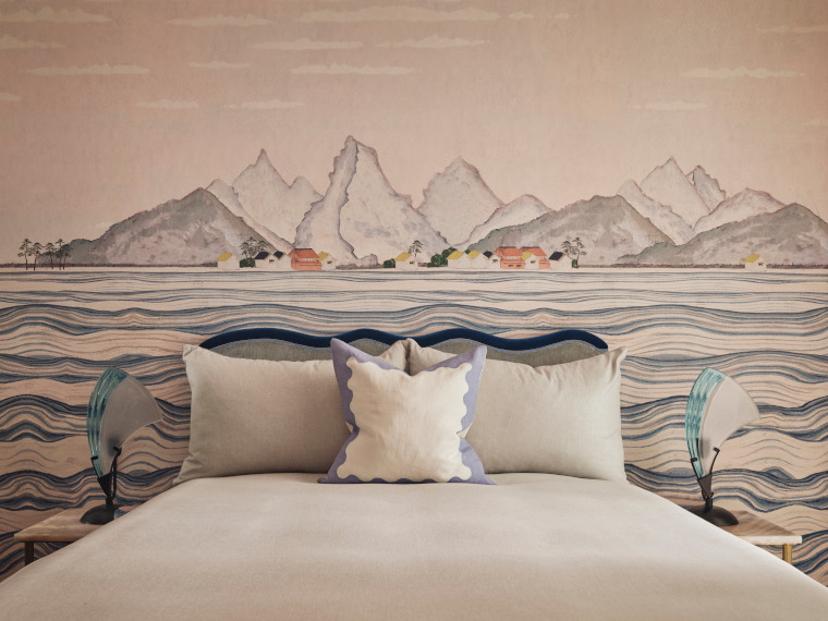
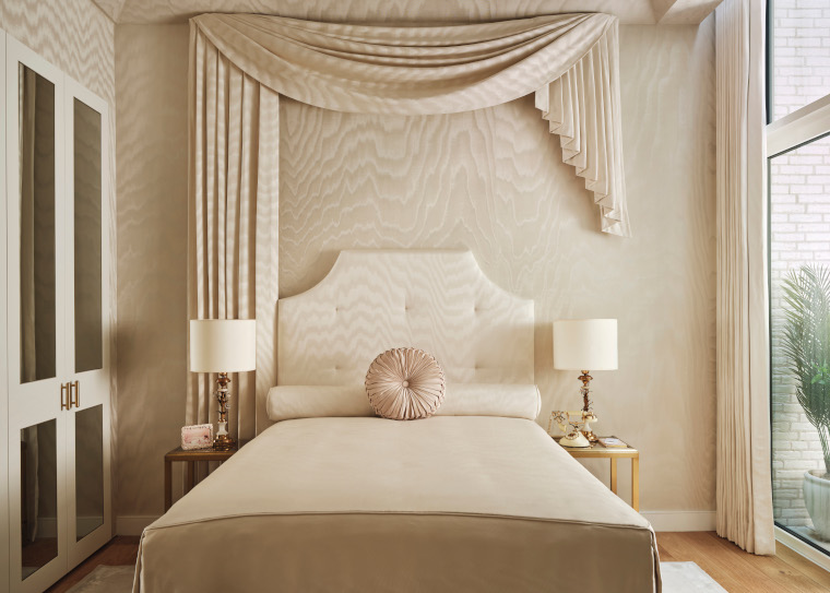
What was your starting point for the interior? In true Studio L style, it’s never any ‘one’ thing that inspires. Photography very much informed this project – specifically work by Slim Aarons, titled ‘Joan Collins Relaxes’, ‘C.Z. Guest’, and ‘Lake Worth’. All his work recalls glamourous golden eras of beautiful people doing beautiful things in fantastical settings. That imagery helped me define the concept, which ultimately morphed into a 1980s Palm Beach vibe combined with the 1950s Hollywood Regency. When I saw the photo of Joan Collins in her powder pink bedroom with her matching pink poodle, that was it. I set myself a challenge to recreate that photo in the primary bedroom with an elevated modern look.
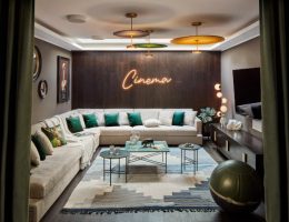
We graduated the décor’s impact along the way to tease out the sense of luxury built-in within this apartment and make the decor surprising and exciting enough that people want to journey through to see the entire home. I also wanted to infuse a sense of 80s nostalgia and pull from my childhood with references to Memphis Design, colour blocking, pastels and neon with ditsy florals, oriental decor and stylised graphics. I felt the combination of Hollywood Regency and 80s glamour was a closely related enough combination of styles to pull from and combine.
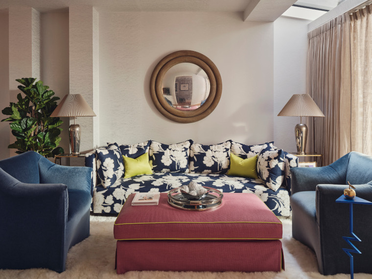
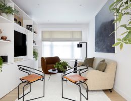
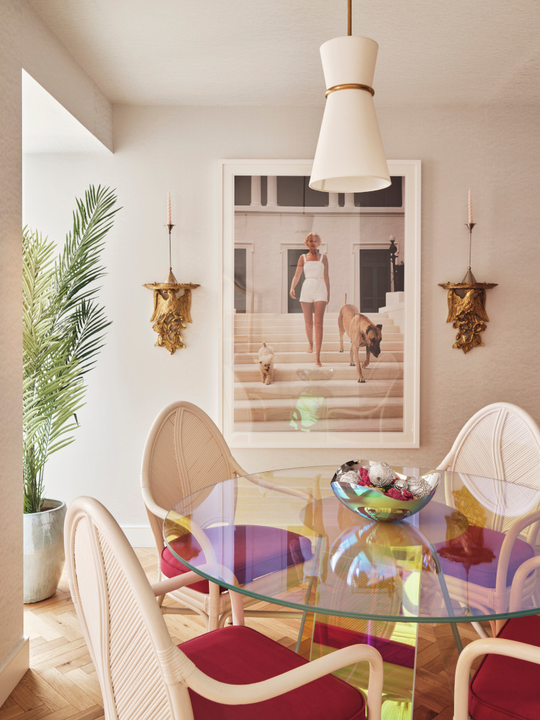
How did you decide on the colour palette? With a reference combination of old Hollywood and the 80s, one of the common links between the two eras is the use of pastels and intensely saturated colours – it could go either way. From there, I knew two things. First, we were going to use that beautiful powder pink pastel moiré for the Joan Collins-inspired room, so that colour became vital. The second was that we would also incorporate a neon acid green into the décor. From there, it was about creating a more comprehensive colour story to build a cohesive bridge between the two. You’re immediately greeted with a soft pastel blue sisal wallpaper when you enter the flat. Then a small punch of the acid is introduced in the sitting area with the deco cushions and piping on the ottoman.
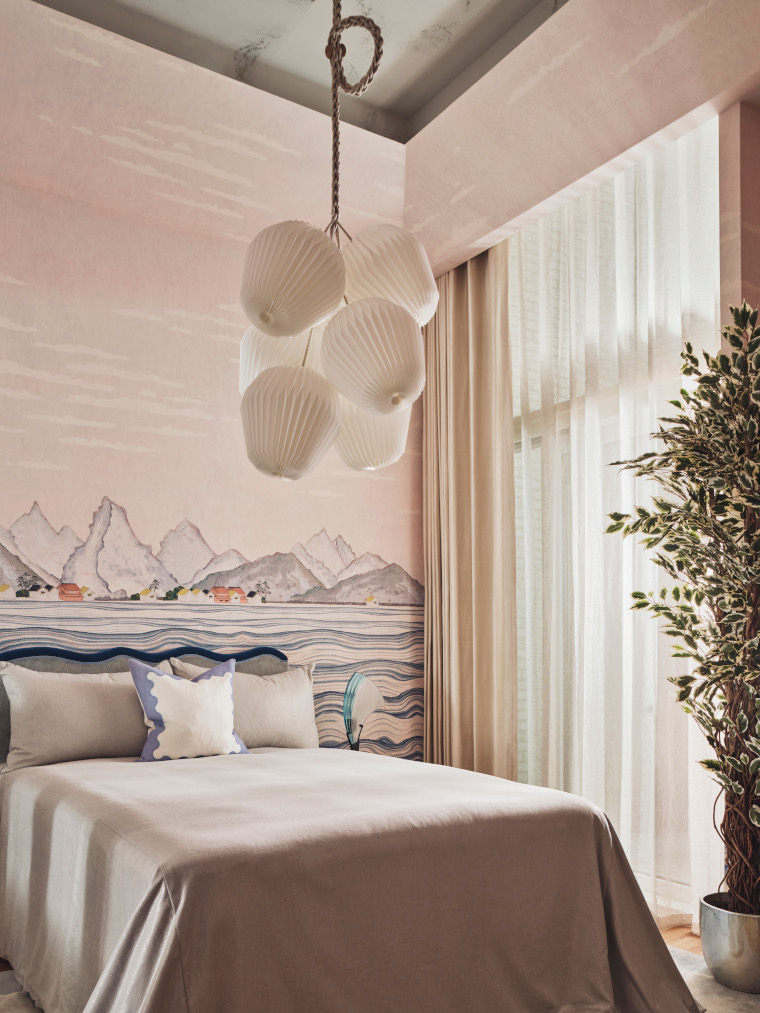
Did you specify any bespoke pieces for the project? The apartment features quite a few bespoke pieces. On the ground floor, in the sitting room, I designed the A.V. cabinet, cushions and the ottoman, curtains and sheers and the butcher’s block island in the kitchen. On the lower ground floor, In the primary bedroom (inspired by Slim Aarons’ photo Joan Collins Relaxes), I designed the headboard, asymmetrical swag, bolster, bedspread and curtains. In the second bedroom, I created the irregular wave headboard to sit within the waves of the mural wallpaper, the bedding and the curtains. In the third bedroom, we upcycled by reupholstering the bed to suit and designed the neon curtain and the deco cushions.
Another bespoke design is the stair runner, an ombré with a darker citrine green at the top that gets lighter as you move towards the lower ground floor. I designed it to arc on the half-landing instead of being a straight corner coverage. I felt the detail helps draw your interest downward and naturally makes you gravitate toward wanting to turn the corner.
Sometimes show home interiors can be a bit bland to appeal to the widest possible audience, but you have made some bold decorative decisions. Why? For as long as I’ve been doing development work I’ve treated show homes as one-off custom designs. And have been pushing the status quo around this matter. It’s an outdated belief hangover from the polite way agents motivated homeowners to tidy up/de-clutter their homes to make them easier to sell. And rightly so – but that’s where that belief came from and it became the popularised norm.
I try always to remember that purchasing a home is one of the most significant investments anyone will ever make and aspire to have. Therefore, give people something worthwhile to remember with thought and care. I feel it’s about respecting the purchasers as well as the home. It’s no different than going into a private residence for sale and falling in love with it largely because of how the homeowner has it decorated. That happened to me and my husband, where we currently live. Although it wasn’t entirely our style, we adored the charming way the owners had painted and decorated it. Ironically, it was on the market longer because of that. When I saw it advertised, I knew it would only be for some, so we jumped on it
Trying the one size fits all approach is a different model than what my partner and I set out to do. My theory is the world is a much smaller place due to social media and everyone is exposed to masses of styles at a vast rate, so they’re not as fixed. Why not inspire potential purchasers and show them how they can transform a ubiquitous white box space? Because of it, we could find our niche in the industry.
What was the biggest challenge? The spatial challenges of the apartment informed the brief. It’s a ground and lower-floor duplex that will appeal to only some. It’s also tucked away in the corner off the resident’s courtyard, so it’s hushed for a city apartment. So quiet that it could verge on feeling too private for some. Hence, it was essential to enhance that sense of being enveloped and add depth, colour, pattern and atmospheric ambient lighting. I knew my job was to draw out the apartment’s best features and add drama in a luxurious, fun and wholly unexpected way. The entire apartment took a year from initial design concepts and final installation.
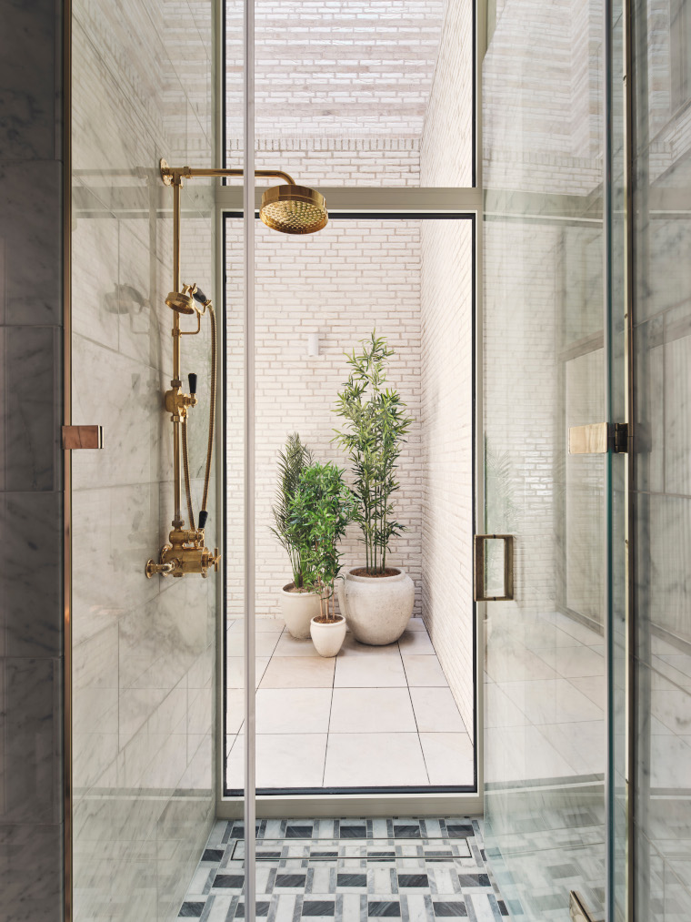
What is your favourite design feature? Regarding the architecture, I love the seductive shower in the primary bedroom ensuite that Openstudio Architects created. It has a 4m tall floor-to-ceiling glass windowpane looking onto the private lightwell. It’s a rare treat for London because it feels like a sophisticated indoor/outdoor shower. Mainly because the lightwells are covered in this fully glazed iridescent hand-made brick, it already has a bit of a beach vibe.
And as far as the décor, honestly, it’s hard to choose, but I do love the surprising impact of the ultra-glamourous primary bedroom. It’s so unique and the execution had to be perfect. We had a few hiccups but managed to pull it off.
(Photography: Studio Rochowski)